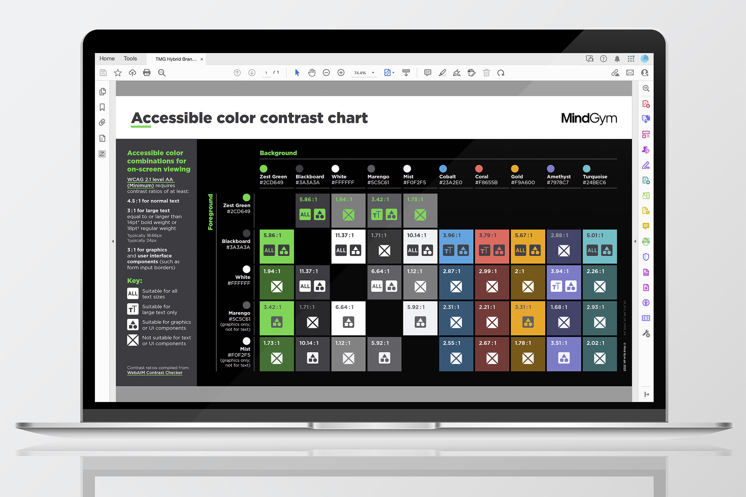
MindGym Color Contrast Chart
Created to visualize compliant and non-compliant combinations within MindGym’s brand palette. The chart served as an internal reference for ensuring accessible use of color, specifically addressing contrast.
Role
Designer and production specialist, responsible for concept, layout, and introducing the chart to the team.
Design highlights
-
Developed a clear visual system for comparing color pairings at a glance.
-
Balanced simplicity with precision, making the chart usable by both designers and non-designers.
-
Limited the documentation to hex values, providing a concise and practical reference.
Production methods
-
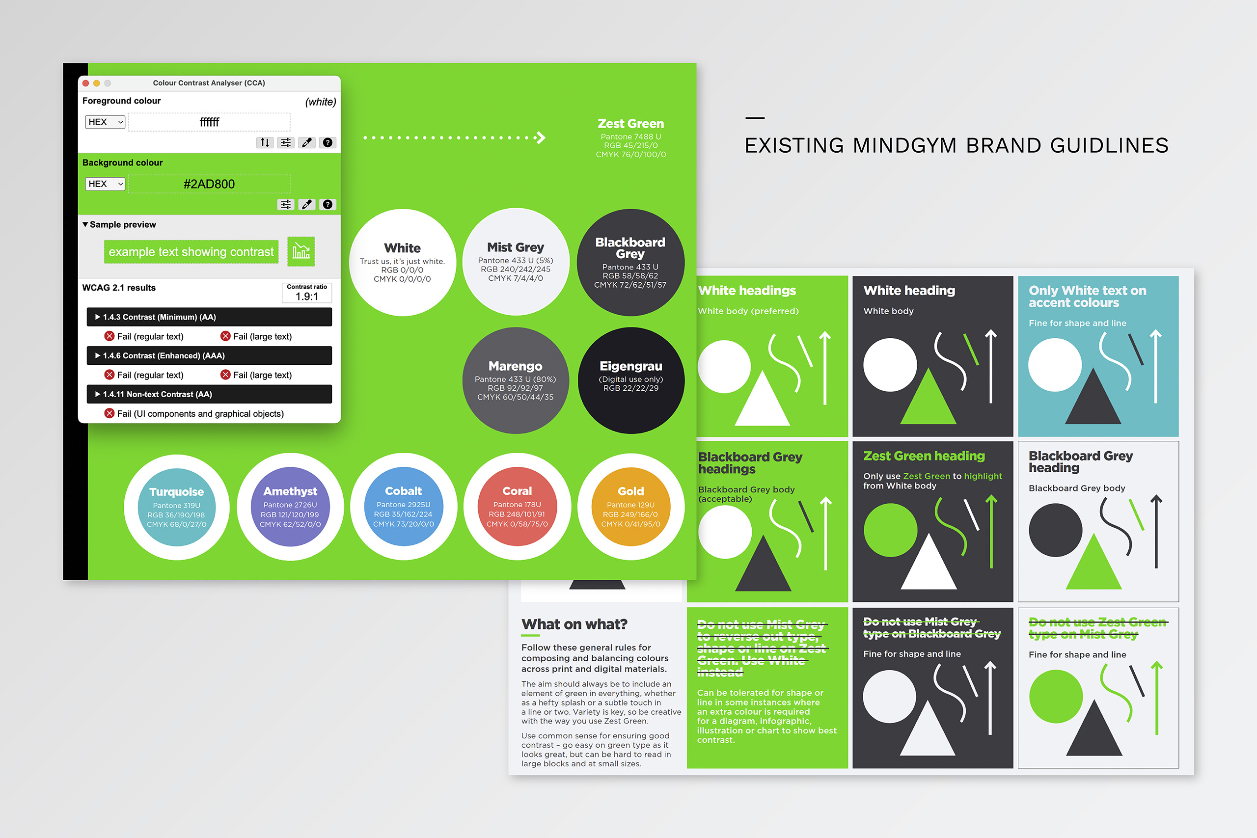
Checked color pairings against WCAG 2.1 contrast ratio standards.
-
Built the chart as a scalable vector file to maintain clarity in both print and digital contexts.
-
Exported optimized versions for internal distribution as PDF and for use in slide decks.
Results
-
Equipped designers with a quick, reliable guide to contrast-compliant color choices.
-
Upskilled colleagues by explaining how to read and apply the chart, first within the design team and later with non-designers.
-
Reduced errors and inconsistencies in color usage across deliverables.